Porsche finally shows the interior of its new electric car
-

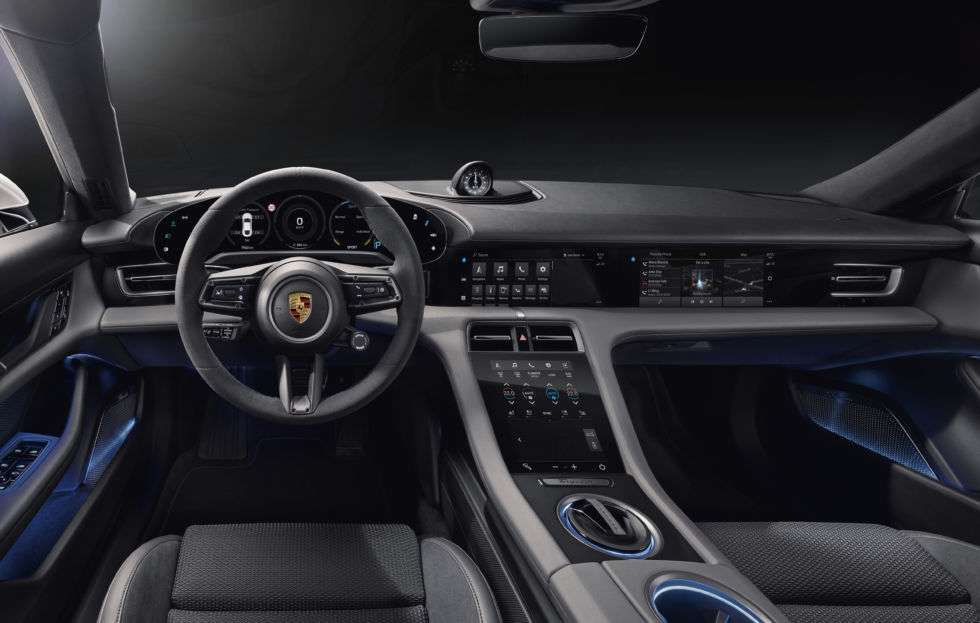
The line of the dash as it rises and falls over the main instrument display is classic 911. But the execution is ultramodern minimalism. [credit: Porsche ]
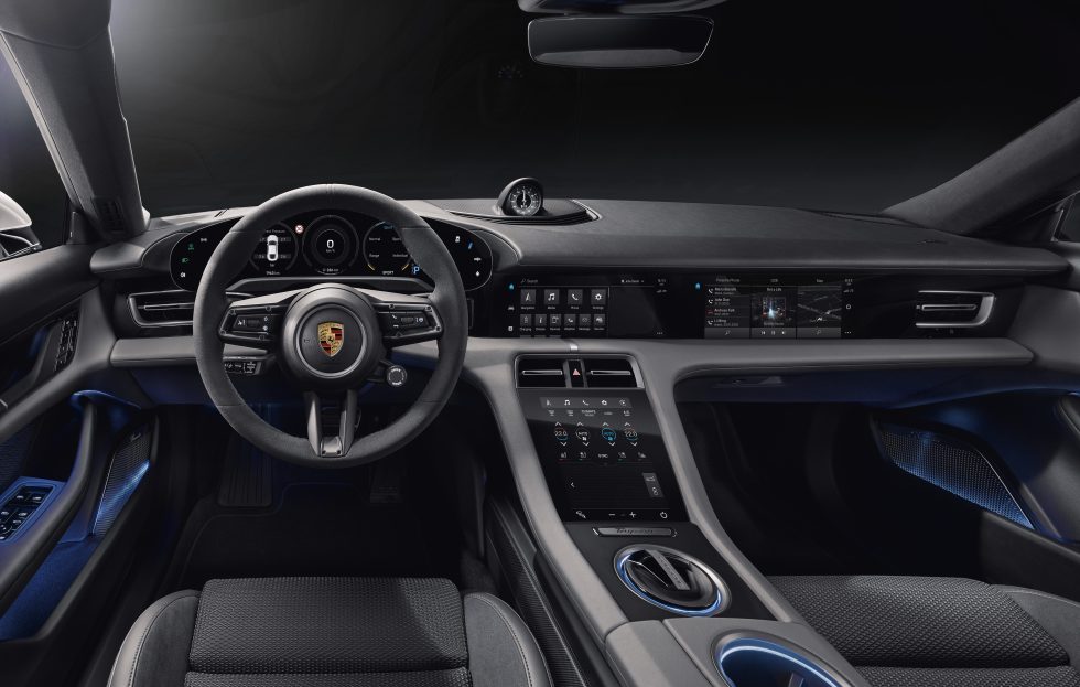
I know, the slow drip of news from Porsche about its forthcoming Taycan electric car is starting to grate. “Just show us the damn car,” you’re probably thinking. I am, but I don’t set the embargoes, and so here we are again. I’ve just got back from a long day’s briefings about the new electric car, but I still can’t tell you most of what I learned yet. However, today the company has allowed us to share these images of the interior.
It’s unmistakably a Porsche to look at; the original 911 was a heavy influence for both the driving position and also the shape of the dashboard. But it’s also unmistakably futuristic—the main instrument panel is a single, slightly curved 16.8-inch display. Not only is it the biggest screen I’ve seen used like this in a production car, it sits naked, without a cowl to shade it from bright sunlight. To combat glare, the screen is coated with a polarized layer, and it is angled slightly off-vertical to minimize reflections.
The Taycan’s design team has created a radically simple new look for the main instrument panel. The “Classic” mode—seen in these studio shots—is a minimalist take on the traditional horizontal cluster of round dials and gauges. You can replace the center dial with a moving map—also minimalist white-on-black, and oh so tasteful, or go the whole hog and make the entire main display the map. And there’s a Pure mode which just gives you your speed, cutting out all the other distractions like you were able to do with a Saab. Around left and right edges of the main instrument display are icons for functions like the headlights, ride height, and so on. (These are also the buttons to control them, but this is not a touchscreen, and those icons never move.)
Read 3 remaining paragraphs | Comments


