Most mobile browsers display the Web, that’s it—Vivaldi Mobile can change that
-
Here are a few of what Vivaldi views as the key features of its new mobile browser: up first, Notes. “The Notes tool lets you jot down ideas and gather inspiration without interrupting your browsing by jumping to a separate app. Create Notes as you browse and sync them securely between all your devices.”
-
The Capture tool lets users take screenshots of full webpages or a selection of the screen using built-in functionality.
-
Speed Dials are customizable thumbnail links that can be grouped into folders, letting users get where they want to go faster.
-
Vivaldi’s mobile tab switcher.
-
Vivaldi also offers private browsing in its new mobile offering. “We don’t collect any data on how you use Vivaldi. Websites you visit, cookies, and temporary files will not be stored on your device when you browse in a Private Tab.”
Vivaldi—makers of the power user’s favorite Web browser—has finally released a mobile version. Vivaldi for Android (sorry iOS users, it’s Android-only for now) brings most of what’s great about Vivaldi to your phone, and thanks to Vivaldi’s sync service, you can even have all your desktop data on your mobile device.
Web browsers are perhaps the most important piece of software we use in 2019. Our devices are often little more than small windows onto the Web, and the browser is what we use to see and explore what’s in that window. For all its importance though, the modern browser, especially the mobile Web browser, offers precious little in the way of features. It displays the Web and… that’s about it. Want to interact with what you see? You’re mostly out of luck.
Most people probably like their browser this way. Google, maker of the most widely used mobile browser, rarely does anything without extensive user testing. If Chrome is minimalist, it’s safe to assume it’s that way because Google has determined that’s what its users want. And since most other browsers copy whatever Google Chrome does, most mobile Web browsers end up as minimalistic pieces of software.
On the desktop, of course, there has long been an exception to the uniformly dumbed-down offerings of Chrome, Firefox, and Safari—Vivaldi.
Led by CEO Jon S. von Tetzchner, co-founder and former CEO of Opera, Vivaldi’s primary goal is to build a useful browser, a tool you can bend to your will rather than the other way around. You can customize Vivaldi the way you like. Its preferences may be overwhelming at first glance, but if you dig in, you can make Vivaldi do just about whatever you want it to do. For this reason, Vivaldi is often called a “power user’s browser” (as opposed to, I guess, the powerless user’s browser).
For all that, there was always one big problem with Vivaldi: it was desktop only. The company said it was working on a mobile version from the beginning, and von Tetzchner told me several times he was already using it. But there was nothing for the rest of us.
Now Vivaldi Mobile is here (again, for Android users at least). Technically, it’s a beta release and all the common cautions regarding beta software apply, but I’ve been using it for over a month now and have had no problems. Or, I should say, I have had problems, but updates prior to the public release eliminated all of them. And even if there were still bugs, Vivaldi would still be more useful than any other browser on my phone based on this recent testing—and yes, I’ve tried nearly all of today’s mobile browsers, even the small, cottage efforts.
-
Vivaldi Mobile’s beta interface, explained.
-
Even though there wasn’t a mobile version of Vivaldi yet, the browser did add the capability to sync across machines in its 2.0 release.
Sync and Mobile UI
The first thing you’ll notice is that Vivaldi Mobile is surprisingly feature-complete for a beta release.
The headlining feature for now—aside from the mere existence of a mobile version—is the syncing. Building on the syncing support that debuted in Vivaldi’s 2.0 release, all your bookmarks, tabs, history, and notes are now available on your phone.
The sync happens both ways of course, so I can click the cloud icon at the top of the browser on my laptop and get quick access to any open tabs on my phone. Notes and bookmarks from my phone appear whenever a sync happens, too.
If you, like me, make heavy use of Vivaldi’s bookmarks, notes, and history search, having this synced to your phone is enough to make Vivaldi Mobile more powerful than other mobile browsers. But of course, Vivaldi’s take on mobile isn’t limited to syncing.
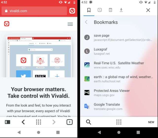
Unlike more minimalist mobile browsers, Vivaldi adds a menu bar to the bottom of the page and gives you quick thumb access to a series of options along the bottom of the screen. On the left is the mobile version of Vivaldi’s Panel, which brings up a new screen that contains bookmarks, history, notes, and downloads. Swipe horizontally to move between them.
Unlike the desktop, you can’t add anything to this panel. And frankly, doing so wouldn’t really make sense. This is an overlaying screen that hides the rest of your content, not a side panel.
The bottom menu bar also offers back and forward buttons, speed dial, and access to all your open tabs. The center button is actually context-based, so it’s a speed dial button on a webpage. When you’re in speed dial, on the other hand, the center button becomes a search button.
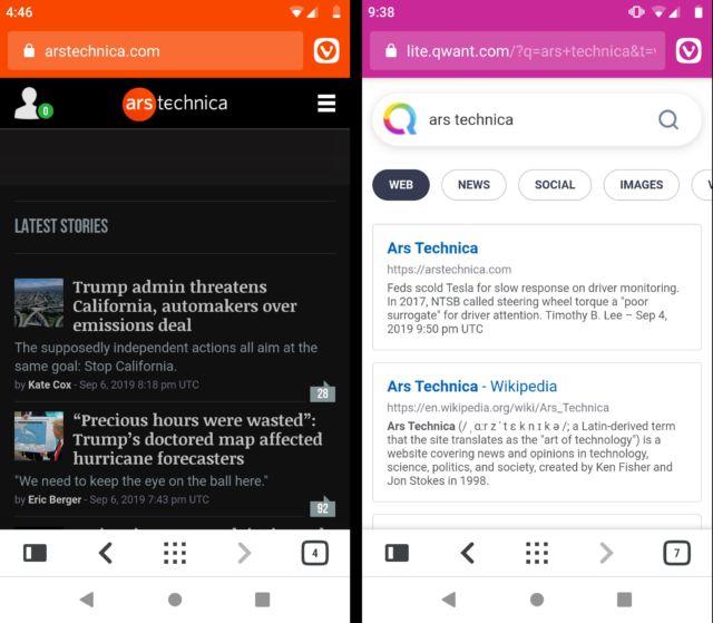
When you scroll content, both the bottom menu bar and the URL bar are hidden away, maximizing the amount of space available for the actual website. Scroll up and both bars come back. This strikes a convenient balance between having the tools you want at your fingertips and yet also being able to focus on the content of a webpage.
At the top of the screen are a URL bar and a Vivaldi icon. As with the desktop version, you can prefix your searches with a letter to use different search engines. For example, the string “d Vivaldi” will search DuckDuckGo for the term “Vivaldi.” The mobile version supports the same search engines found in the desktop version.
Tap the Vivaldi icon and you’ll get a main menu very similar to what you’ll see in Chrome or Firefox. There are, however, some Vivaldi-specific customizations, like an option to clone the current tab, to add a bookmark, to access your recent tabs, or to grab a screenshot of the current page. The latter will produce a screenshot of either the current viewport or the entire page. Screen captures are, unfortunately, not currently synced with the desktop.
You can work around the lack of image sync using a separate sync service like Nextcloud or Dropbox. I set up Nextcloud to automatically upload anything in the Vivaldi screen captures folder on my phone and sync it to the Vivaldi screen captures folder on my laptop. It’s not ideal, but until Vivaldi supports syncing images, it works. I should also note that Vivaldi doesn’t currently sync images attached to notes. You do get all your notes synced from the desktop, but not the images that go with them. Currently there does not seem to be a way to add an image to a note in Vivaldi Mobile.
There’s also a bug in the UI that doesn’t allow you to add a URL when manually creating a note in Vivaldi Mobile. The developers are aware of this, and I was told it would be fixed after launch. For now, if you like having your notes attached to a URL, use the “copy to note” option in the context menu, which will create a note with your highlighted text and attach the current URL to the note.
The main menu is where you access the settings for Vivaldi Mobile. It’s early days for Vivaldi Mobile, so there’s currently nowhere near the level of settings and UI control you’ll find in the desktop version. There are all the standard settings inherited from Chromium—passwords, payment methods, saved address controls, notification settings, privacy, accessibility, and so on—along with some Vivaldi-specific controls like the option to set your default search engine and sign into your Vivaldi sync account.
One of the things that sets Vivaldi apart on the desktop is the way it allows you to interact with the Web more than most browsers. The best thing about the mobile version is that Vivaldi has stuck with this approach of doing more. The tools for interacting with the Web (creating notes, for example) are largely the same in the Mobile Version. For example, select some text and the context menu that appears will have an option to “copy to note.” This mirrors the context menu on the desktop.
Similarly, tools like page capture don’t just exist, but they are easy to access—just one tap to open the main menu, another to capture the page. It’s a refreshing change from the usual, “bury it five menus down so it’s not the way” approach of other browsers.
Listing image by Vivaldi


