Android Auto gets a big UI revamp
-

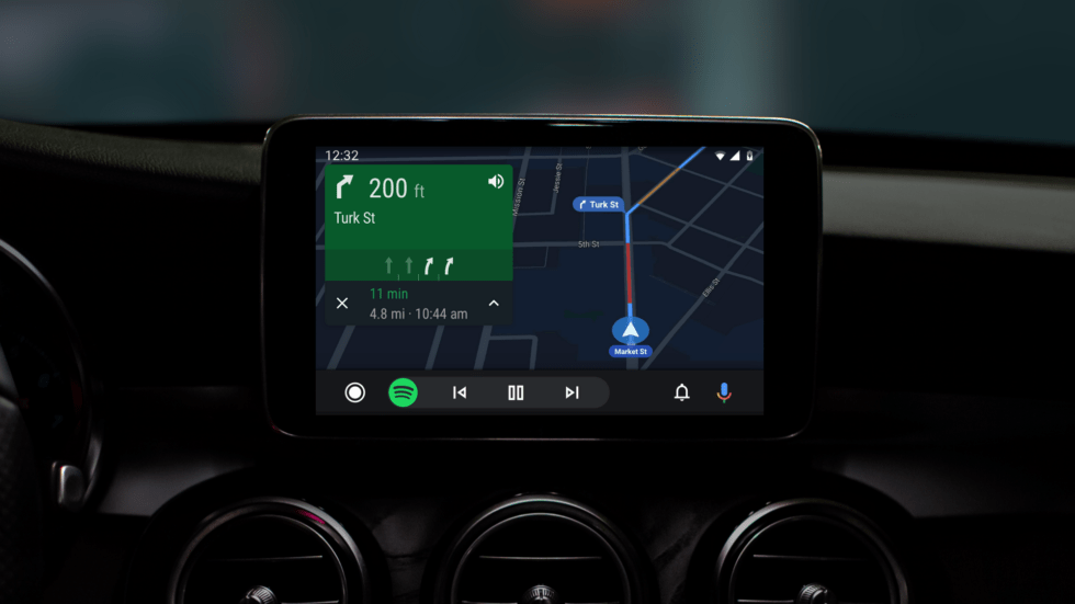
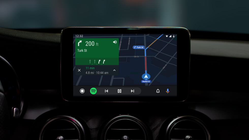
The new Android Auto. The big change is the system bar at the bottom, which can now show tiny app controls. Here are music controls. [credit: Google ]
Google I/O is going to kick off later today, but before the big show starts, Google has pushed out an early announcement: Android Auto is getting a new look. Google’s update won’t arrived until “This summer,” but we get screenshots today showing all the significant new additions.
Google says “The new interface is built to help you get on the road faster, show more useful information at a glance, and simplify common tasks while driving.” In previous versions of Android Auto, a system bar at the bottom of the screen housed five app icons: Maps, Contacts, Home, Music, and a “car” screen (which didn’t have much use). The new version removes the app shortcuts from the system bar’s navigation and instead turns it into a mini app bar. There’s a “Home” button” on the left, notification and voice buttons on the right, and a middle section that intelligently displays a tiny interface from either navigation or your media app. With the Map open, you’ll get music controls at the bottom. With the music open, you’ll see your next turn information.
With most of the app navigation abilities removed from the system bar, Android Auto is switching to a tried-and-true app grid for app navigation. This grid of apps is now the new home screen, and the familiar list of notifications and suggestions (Android Auto’s old home screen) now live under the bell button.
Read 4 remaining paragraphs | Comments


